People still search for “hot air hostess” and “sexy flight attendants”. The phrase continues to deliver traffic even in an era that claims to have moved beyond objectification. What persists is not fantasy. It is design. It is a deeper pattern: the airline industry has long understood that appearance is one of the most powerful tools for shaping perception before a single word is spoken.
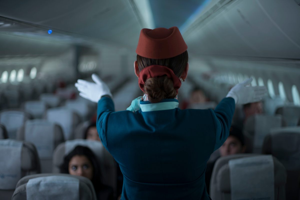
The image of the polished, attractive cabin crew is not accidental. It is carefully designed. Airlines have known for decades that passengers form their first and strongest impression of the entire flight experience within moments of boarding. Uniforms, posture, grooming, and smile become silent signals of discipline, care, safety, and glamour.
What looks like simple attractiveness is rarely just that. It is a performed language of control, reassurance, and cultural ideals of service. This is why the “hot air hostess” trope refuses to disappear completely, even as uniforms have become more modest and airlines speak of professionalism and inclusivity. Airlines invest heavily in branding and service training standards.
NOTE: This article was just updated in 2026 from its original version. All information below reflects current conditions, verified facts, and updated practical details as of this revision.
Uniforms in aviation have always been more than clothing. They are a uniform in the truest sense, a way to make individual bodies represent something larger than themselves. The airline becomes visible through the bodies of its cabin crew. Height, figure, grooming, posture, and facial expression are turned into brand assets.
From the outside, this can look like superficial emphasis on beauty. From the inside, it is a sophisticated system of emotional labor. Flight attendants are trained not only in safety procedures but in emotional regulation; remaining calm, pleasant, and attentive while managing fear, turbulence, difficult passengers, and long hours in confined spaces. The polished exterior is the visible part of invisible work.
The returning perspective sees this clearly. In both Australian and Philippine contexts, we understand that presentation is rarely neutral. It carries expectations about femininity, deference, competence, and approachability. What passengers interpret as “natural attractiveness” is often the result of years of selection, training, and subtle pressure to embody an ideal that makes the airline feel safe, luxurious, or exciting.
Most travelers believe they notice the aircraft, the seat, or the service. In reality, the first thing registered is the crew. The way they move, speak, and carry themselves sets the emotional tone for the entire flight. This is not shallow. It is psychological. Humans read faces before facts. Airlines design around that.
The “hot air hostess” image persists because it taps into a simple equation many passengers still carry: attractive = competent = reassuring. It reduces anxiety about flying. It makes the unknown feel more manageable. But this shortcut comes with a cost. It places enormous pressure on crew members to perform attractiveness and warmth even when they are exhausted, unwell, or dealing with difficult situations.
Top 10 Airlines Often Associated with “Hot Air Hostess” Searches
1. Singapore Airlines
Singapore Airlines presents one of the most enduring and recognizable images in aviation. The “Singapore Girl” in the sarong kebaya is not just a uniform. It is a constructed identity that has remained consistent for decades. The silhouette, fabric, and styling are immediately identifiable, designed to signal elegance, cultural continuity, and controlled warmth.
From the outside, the image feels effortless. The posture, tone, and composure appear natural, almost instinctive. That effect is produced through rigorous selection and training. The expectation is not only to deliver service, but to maintain a specific emotional presence throughout the flight. Calm, attentive, and quietly accommodating regardless of circumstance.
What stands out is how closely appearance and behavior are fused. The uniform does not operate separately from the role. It reinforces it.
Every gesture, expression, and interaction is part of a larger system designed to deliver a consistent experience. The result is not just good service, but a recognizable standard passengers expect before boarding.
In this context, the “Singapore Girl” becomes more than branding. It is a controlled expression of hospitality where visual identity and emotional labor are aligned. The elegance is real, but it is also maintained. Precision sits behind what appears soft. And that combination is what makes the image so enduring.
Singapore Airlines cabin crew in sarong kebaya uniform, where appearance, posture, and emotional discipline are aligned into one of the most consistent service identities in global aviation.
Singapore Airlines cabin crew in business class, where service precision and environment are engineered to maintain calm, control, and consistency throughout the journey..
2. Virgin Atlantic
The red suits and silk neck ties are iconic. Even as makeup rules relaxed and uniform options expanded, the visual memory remains intact. The “Red Hotties”branding worked because it framed confidence as both visible and controlled. British restraint sits beneath the boldness, giving the image structure rather than chaos.
What reads as sex appeal is not accidental. It is calibrated.
The styling, posture, and tone create an attractiveness that feels approachable, but never uncontrolled. There is a boundary built into the presentation. It invites attention, but manages it.
The uniform signals something more precise than glamour. It suggests competence with personality, discipline with ease. This balance is what makes the image hold. Too much control would feel cold. Too much expression feels unstable. Virgin Atlantic sits deliberately in between.
What appears confident is maintained. The ease is structured. And the appeal works because it gives passengers something immediate to trust, before anything else is proven.
What looks like confidence is carefully constructed. The uniform does not just represent the airline. It shapes how passengers feel before anything is said.
3. Etihad Airways
Etihad Airways approaches presentation with a different logic. The uniform is not designed to stand out, but to integrate into a system of controlled comfort. Tone, tailoring, and grooming align with a brand that prioritizes refinement without excess. Nothing feels accidental. Everything is calibrated to support a stable, predictable experience.
Passengers notice the polish first. The posture, stillness, and measured tone of interaction create an immediate sense of order. But what holds the experience together is not appearance alone. It is the consistency behind it. On long-haul flights, where fatigue sets in and small discomforts accumulate, that consistency becomes the real signal. The environment feels stable, even when the body is not.
What appears effortless is sustained through discipline. The crew regulates not only safety and logistics, but tone, pace, and emotional temperature. The uniform reinforces this by projecting control without rigidity and composure without distance. It suggests that everything is being managed, even when it is not actively noticed.
Etihad’s version of attractiveness is less about visual appeal and more about coherence. The experience feels smooth because it is tightly controlled beneath the surface. Comfort here is not incidental. It is constructed, maintained, and repeated until it feels natural.
Etihad trains movement to feel effortless. It’s choreography designed to make control feel like comfort.
4. Cathay Pacific
Cathay Pacific presents a more complex tension between image and reality. The uniforms are often read as elegant, fitted, and subtly refined. From the outside, the impression is controlled femininity — polished, precise, and slightly softened at the edges.
But this surface has been contested from within. Crew members have pushed back against elements of the uniform they experience as restrictive or overly exposing. What passengers interpret as “subtle attractiveness” can feel, in practice, like constraint. The presentation is not neutral. It is negotiated.
This reveals a deeper pattern. The airline’s image depends on a balance between refinement and comfort, but that balance does not always hold evenly for those wearing it. The expectation is to maintain composure while embodying a specific visual standard, even when that standard creates friction.
What stands out here is not just appearance, but tension. Cathay Pacific is one of the clearest examples of how corporate image and lived experience can diverge. The uniform signals elegance and control. The reality behind it involves adjustment, compromise, and ongoing negotiation.
In this case, “attractiveness” is not simply designed. It is maintained under pressure. And that pressure is part of the system itself.
Appearance is controlled, but not always comfortable. The image passengers see is part of a system that does not feel the same from the inside.
What looks polished and effortless is carefully maintained. The image passengers read as elegance is shaped by standards that don’t always feel the same from within.
5. EVA Air
EVA Air’s reputation for cleanliness and service is strong, yet incidents occasionally surface that expose the strain beneath that polish. What is presented as seamless care often depends on work that remains deliberately unseen.
The uniform projects calm competence. It signals order, reliability, and quiet control. But that composure is not passive. It is maintained. It requires constant adjustment, especially when passengers cross boundaries that were never meant to be negotiated in the first place.
What appears as professionalism is, in many cases, sustained emotional regulation under pressure. The expectation is that the surface remains undisturbed, even when the situation underneath is not.
The contrast is subtle but consistent. The image suggests ease. The reality often sits much closer to the limits of what a person can reasonably absorb without reaction.
Calm on the surface is carefully maintained. What looks effortless is often sustained under pressure.
6. Thai Airways
Thai Airways presents a form of hospitality that feels less constructed and more embedded. The uniform, posture, and tone reflect a cultural baseline rather than a purely corporate design. What reads as warmth is not just trained behavior, but shaped by social norms around respect, softness, and attentiveness.
From the outside, the service can appear gentle and effortless. The gestures feel natural, the tone unforced. But this ease is still structured. It is maintained through discipline, repetition, and expectation. The difference is that the structure aligns closely with cultural behavior, so it feels less mechanical and more intuitive.
What stands out is the consistency of emotional tone. Calmness is not just performed during ideal moments, but sustained across delays, fatigue, and difficult interactions. The uniform supports this perception, but it is the behavior that carries it. The visual presentation reinforces what the interaction delivers.
In this context, Thai Airways represents a system where hospitality is not exaggerated or stylized. It is controlled, but it does not feel imposed. The result is a quieter form of reassurance. Not built on glamour or precision alone, but on a steady emotional presence that passengers recognize without needing it explained.
Thai Airways cabin crew, where traditional design and composed presence reflect a system of hospitality shaped by cultural warmth and quiet discipline.
7. Qantas
Qantas approaches presentation with a different priority. The uniform emphasizes practicality, clarity, and approachability rather than visual allure. The design reflects the airline’s broader identity. Grounded, reliable, and shaped by a multicultural workforce rather than a singular aesthetic ideal.
From a distance, it appears less striking. The image does not rely on tight silhouettes or overt signals of attractiveness. Instead, it communicates stability. The expectation is not to impress immediately, but to reassure over time. In long-haul travel, that distinction matters.
What stands out is the shift in emphasis. The crew is not positioned as part of the visual spectacle of the flight experience. They are positioned as operators within it. The uniform supports movement, endurance, and clarity of role rather than controlled presentation.
In this context, attractiveness is not removed, but deprioritized. Trust replaces it. The signal changes from “look” to “reliability.” And for many passengers, especially on longer routes, that is what ultimately holds more weight.
With Qantas, nothing asks for attention. The uniform is designed to make reliability feel obvious.
Qantas shifts away from attraction and reinforces trust, reliability, and controlled professionalism.
- Hot Air Hostess List -
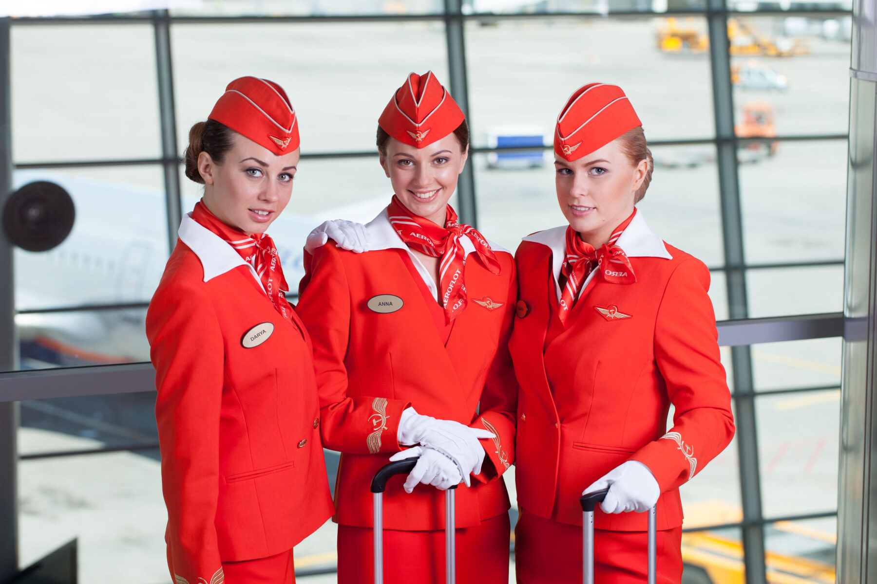
8. Aeroflot
Aeroflot presents one of the clearest examples of appearance used as enforcement. The uniform is precise, structured, and highly controlled, designed to project discipline, authority, and order. The visual message is immediate. Nothing is left ambiguous. Every detail signals that standards are not flexible.
From the outside, it reads as elegance with edge. The sharp tailoring, bold color contrast, and composed demeanor create a strong first impression. But beneath that image is a system built on strict expectations. Grooming, body standards, and presentation are not suggestions. They are regulated. The consistency passengers see is maintained through rules that leave little room for variation.
What stands out is how closely appearance is tied to compliance. The uniform does not just represent the brand. It reinforces it. The body becomes part of the standard being enforced. This creates a form of control that is visible without being openly stated. The image appears polished, but it is also monitored.
In this context, Aeroflot represents a system where beauty is structured and maintained through discipline. The result is a presence that feels authoritative rather than inviting. Not designed to attract attention, but to establish order. The control is subtle in presentation, but firm in expectation.
Aeroflot cabin crew in red uniforms, where precision and strict grooming signal control and discipline.
Aeroflot cabin crew, where strict standards make discipline immediately visible.
9. VietJet Airlines
VietJet Airlines operates on a different axis. Where most airlines calibrate appearance to signal safety, calm, or controlled elegance, VietJet leans directly into visibility. The uniform, styling, and occasional promotional choices are designed to attract attention first, interpret meaning later. It is a deliberate shift from reassurance to stimulation.
From the outside, this reads as bold, modern, and unapologetic. The brand positions itself as energetic and disruptive, targeting a younger, price-sensitive market that responds to novelty and shareability. In that context, the more revealing or stylised elements are not accidental. They are marketing decisions. Visibility becomes currency. The more the image circulates, the more the airline stays present in public memory.
But this approach exposes a different layer. When appearance is pushed toward attention, the boundary between brand identity and objectification becomes harder to control. What is framed as confidence or freedom can also be interpreted as spectacle. The same image that generates interest can reduce the role to surface-level perception.
What stands out is the trade-off. Attention increases, but so does ambiguity. The uniform begins to carry multiple meanings at once. For passengers, it can feel engaging or unconventional. For crew, it can place pressure on how they are seen and treated. The system becomes less about quiet control and more about managing reactions.
In this context, VietJet represents a model where visibility is prioritised over stability. The brand benefits from being talked about, but it operates closer to the edge of what passengers expect from cabin crew presentation. The result is not a breakdown of the system, but a shift in how far it is willing to stretch. Attention is gained quickly. Control becomes something that has to be maintained afterward.
VietJet Airlines promotional crew, where bold styling is used to capture attention and push the boundaries between branding, visibility, and perception.
VietJet Airlines cabin crew in red uniforms, where playful styling and visibility are used to capture attention while still maintaining a structured brand identity.
10. Air Serbia
The uniforms retain a quiet elegance that feels rooted in European tradition. The tailoring, color, and restraint suggest continuity rather than trend. It does not try to stand out. It is designed to hold a consistent standard.
Passengers often comment on the beauty of the crew, but what they are responding to is not only appearance. It is familiarity. In an industry defined by constant change, that consistency becomes its own signal. The visual language remains stable even as routes, ownership, and expectations shift around it.
What appears as attractiveness is doing more work than it seems. It softens uncertainty. It creates a sense that the experience is ordered, predictable, and under control. The uniform becomes a bridge between past and present, carrying forward a version of service that feels dependable even when the system behind it is evolving.
Beauty here is not excess. It is calibration. A way of maintaining reassurance without drawing attention to itself. The promise is not excitement, but continuity. That the journey will be handled with care, in a way that feels familiar enough to trust.
What looks like beauty is structure. Consistency people rely on without noticing.
Hot Air Hostess Top 10 List
What This Actually Reveals
The persistence of the “hot air hostess” image is not about sex. It is about control, reassurance, and the commodification of emotional labor. Airlines understand that passengers buy feelings as much as seats. A polished, attractive crew creates the illusion of order, safety, and care in an environment where passengers have very little actual control.
Uniforms, grooming standards, and presentation rules function as quiet technologies of power. They shape how both crew and passengers behave. What looks like natural warmth is often maintained under pressure. What appears effortless is sustained through discipline. The “sexiness” layer is simply the most visible surface of a deeper system.
From a returning perspective, this pattern is familiar. Whether in Australian efficiency or Filipino relational warmth, presentation is rarely neutral. It carries expectations about how one should move, speak, and respond. The difference lies in how visibly those expectations are enforced.
When the image is stripped back and the system is observed, the “hot air hostess” trope loses its pull. It stops being about attraction and starts revealing structure. What seemed like preference becomes pattern.
The gaze changes. What was once taken for granted becomes visible. Passengers who notice this begin to see the limits behind the performance. They recognise the discipline required to maintain composure in confined spaces, under pressure, and often without acknowledgment.
Respect shifts from appearance to control. From image to effort.
You see flight attendants every flight — polished, composed, and effortless. What most people don’t notice is how much of that presence is designed, trained, and maintained.
Final Reflection
The “Hot Air Hostess Top 10 List” attracts attention because it speaks to something immediate. But it endures because it reflects something deeper. It was never about who is most attractive. It was about what is being signalled, what is being maintained, and what is being expected in return.
Once that is seen, the list stops functioning as entertainment. It becomes a lens.
If something in this article stayed with you, you’ve only seen one layer. There are others, quieter and more consistent in how they shape what you notice and how you respond. Most of it is never explained, only repeated until it feels normal. The surface was never the point. The real question is whether you stop here, or begin seeing what has been shaping everything else all along.
This piece stirred something in you? Share your observations below. The best insights often come from readers who live between worlds.
7 Responses
We are dedicated to providing quality Luxury airport transfers, including comfortable and reliable limousine services. We service all over Dubai city.
Woah! I’m really enjoying the template/theme of this blog. It’s simple, yet effective. A lot of times it’s hard to get that “perfect balance” between user friendliness and visual appearance. I must say that you’ve done a superb job with this. In addition, the blog loads very fast for me on Firefox. Superb Blog!
I would also love to add that in case you do not already have got an insurance policy or maybe you do not form part of any group insurance, you will well benefit from seeking the help of a health insurance agent. Self-employed or people having medical conditions ordinarily seek the help of the health insurance brokerage service. Thanks for your post.
Holy cow! I’m in awe of the author’s writing skills and talent to convey complex concepts in a concise and precise manner. This article is a true gem that earns all the accolades it can get. Thank you so much, author, for providing your knowledge and offering us with such a priceless resource. I’m truly appreciative!
magnificent points altogether, you just gained a brand new reader. What would you suggest about your post that you made a few days ago? Any positive?
I really like it when folks come together and share thoughts. Great blog, continue the good work!
I was able to find good advice from your blog posts.